Visual Specifications
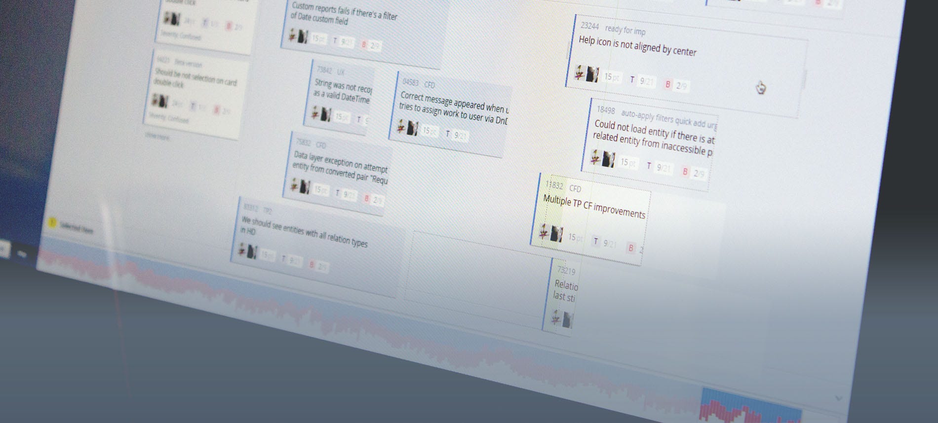 Targetprocess 3 Timeline Design
It’s excruciatingly boring to write specifications. It seems like it’s the most boring thing in the world that a product owner has to do. This could be the reason why most specifications are horrible and come across as the root cause of delays, reworks, and bugs.
This problem can be partly alleviated if a product owner is always available to talk to, but even that is not a cure-it-all remedy.
The agile movement has its peculiar point of view on specifications. The most extreme part of agilists express their feelings quite clearly:
F%$k the specifications!
In agile projects, a requirement usually looks like:
As a user
I want to add a new task fast
To save my time and to keep my context
Surprisingly, this approach works — if all of the following is true:
- the team sits together in one room
- Product Owner is available 24x5
- no QA’s in the team
- designers come up with solutions to ad hoc issues in less than 1 day
If at least one of the above is not true, the team has some serious issues.
Opposing agilistas are those uncommon individuals who are ready to spend ¼ of their lives chiseling exquisite project documentation. They think over each and every detail, meticulously describe all the fields in a form, and drill into all possible negative scenarios. They know for sure how the system will react to a chaotic mouse clicking or an attempt to inject SQL script into Name field. They’re aware of what needs to be done if a data center suffers a direct hit by a meteorite.
Specifications and developers
Some developers don’t like specifications. Let’s call them “class 1 developers.” They know how the system should work and the scenarios in which they can throw the “Unknown error” or “You can’t do that” messages. They also know how to dodge menial tasks.
The very fact of having a specification in place is viewed as imposing limits onto someone’s creativity and a lack of trust — “Ha, do you think we don’t know how to make this feature better?” It’s for this reason that class 1 developers don’t like to read specifications. They may scan them or look at the pictures, but they would hardly read them.
On the other hand, class 2 developers are very different. If a feature has no spec, they feel sad as they sense a lot of rework, overdue word fights, and lame solutions. They know that they would have to clash face-to-face with testers in order to defend what, in their minds, a bug really is. They clearly see that it would take tons of time to get a hold of the product owner and only through sheer use of flattery or cheating could they retrieve answers to their dozen questions.
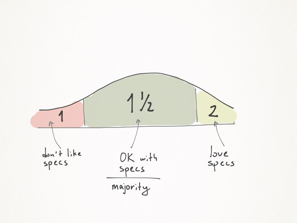 The love-hate distribution chart. Most developers feel OK about specs.
Then we have class 2 developers reading specs from cover to cover, diligently digesting, and formulating questions with deadly precision.
One can come up with any specs for class 2 developers; they will digest anything. Class 1 developers can only be shown pictures with brief captions; but, please, no complicated words. A cartoon would do even better. Oops, I mean an animation.
The common class is somewhere in between the 1 and 2 — let’s call them the 1.5. These developers would want and read specs most of the time. But they are far from being too picky or thoughtful. The majority of developers fall in this class; it’s for these developers that product owners should write specs. In other words, one has to lower the barrier of entry to specs and communicate ideas visually, concisely, and brightly.
Specifications and QA
Life is tough for QAs. An absence of specs turns their work into a slow torture that challenges the limits of human endurance and resistance. What is a bug, after all? It’s a mismatch between the actual system behavior and a spec. No specs? No bugs. Self-indulgent developers take full advantage of this axiom.
For instance, if a company gives bonuses for there being no bugs, then the best way to get a bonus would be to stop doing specs. With no specs there’s no room for problems. Just imagine: product owners do not write specs and use the time they freed up this way to post kitties to Facebook. Developers write bug-less code. QAs find no bugs. Maybe they’ll find one once in a while, just enough to prove that the company still needs them. Everyone feels good. The only ones to suffer are the customers who are exposed to the application’s unpredictable behavior.
For some reason developers can get away with skipping specs. This isn’t so with QA. They will have to delve into any garbage that a product owner had scribbled. They would have to re-read everything and spot discrepancies and ambiguity. Lazy product owners can use this to their advantage: why should someone mess with a spec if QA will fix it?
Points to Note
Let’s now look into some signals that would let even a dummy identify if a specification is good.
Incompleteness
According to Goedel, it makes no sense to have complete specs as an ultimate goal. The very calling a spec “complete” is contradictory. That’s why we have to put up with the fact that any spec is incomplete. What we can hope for, at most, is consistency.
At that point one might want to give up. If there’s no way to come up with a complete spec, then why bother at all? Any sensible attempt to get closer to completeness has many positives and only two negatives: time and effort.
It’s not easy to search for balance in tasks and there’s no one-way answer as too much depends on the context. Only one thing is clear: if developers circle in on the product owner with their 3+ questions once the implementation has started, then one can go as far as to block the product owner’s access to fruit and coffee in an effort to make him get back to work.
So, how complete should specs be? The answer is quite simple. In the beginning, a spec should be limited to several sentences. By the time it gets to implementation, it should be detailed enough that it makes sense from the standpoint of time and effort.
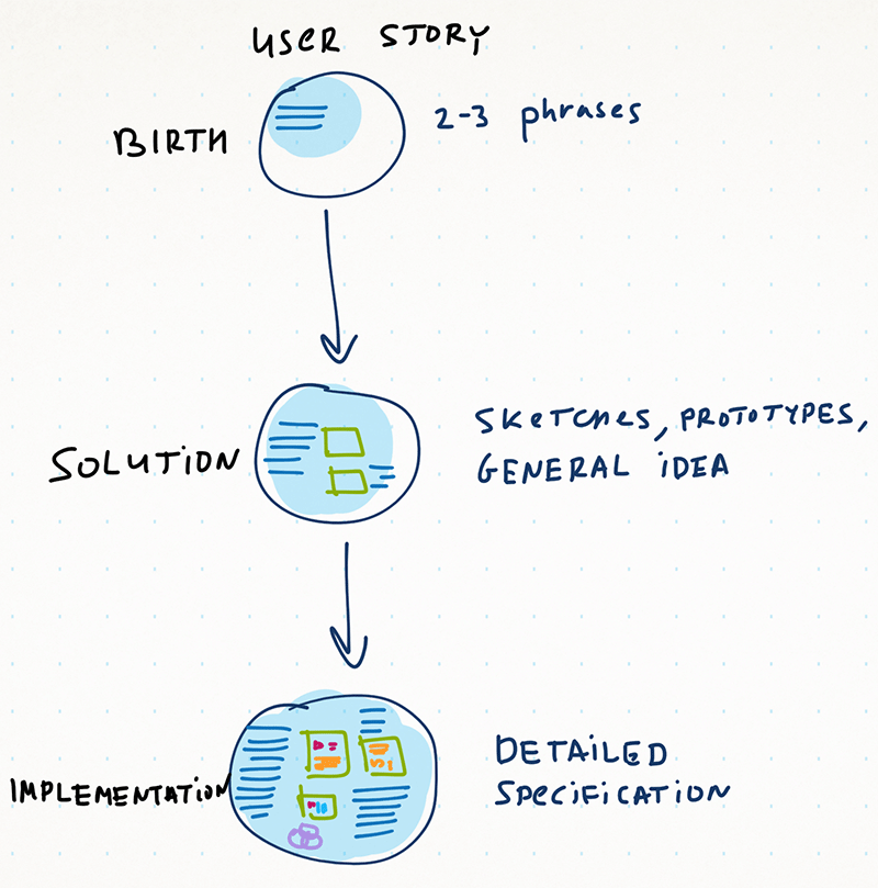 A specification acquires more details as a user story moves forward in development. A couple sentences are enough in the beginning, but the complete spec has to be in place by the time the implementation actually starts.
Ideally, a specification should leave no space for doubt and ambiguity. In practice, as the implementation goes on, various bottlenecks pop up, but with a good specification, there won’t be too many.
If a spec is too brief and/or shallow, then the divergence effect brings the team’s morale down to the bottom of an empty glass. A functional feature grows, shifts, mutates, and reaches out to the most unexpected spots in the application, throwing its roots insidiously just like a cancerous tumor. For many, it may seem that there is no completion in sight; it will require some heroic endeavor to roll up and finish the feature.
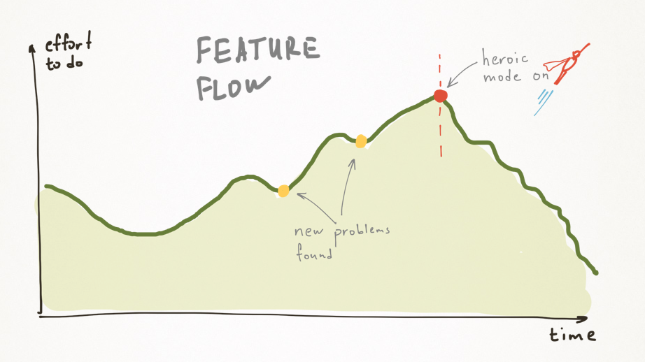 That’s how a feature would typically develop with no or incomplete spec. If some issues pop up, scope creeps. Superman mode is needed to complete the feature.
Mindf&%!ks
Some people like to come off as utterly smart, although this correlates very loosely with their actual capabilities. They would pointedly overuse such words as “correlation”, “divergence,” and “Goedel” in a conversation.
Such people revel in writing overly complicated specs, with paragraph-long sentences divided by semicolons, and — I dread even thinking about it — no visuals at all! Sometimes, due to a highly improbable fluctuation, such destructive “script-writers” find themselves working as product owners.
Not only their specifications are plain boring to read, but one has to waste precious energy trying to understand what it is exactly they meant to say with something like “a user performs the operation of switching to the next section of a client application by double-clicking the left button of a mouse-type two-dimensional manipulator.”
Specifications need to be as simple as possible. Their language should be easy to understand, even for a class 1 developer if he suddenly decides to venture beyond the pictures and actually read something. Have mercy on the developers: they will have to strike some good sweat to implement all your crazy requirements; save them from the jungle of your intellect, at least.
Volume
If a printed specification has enough volume and weight in it to injure a fragile QA girl, something is apparently wrong with it. A reasonably sized specification should be enough to kill a mosquito, or a fly, at most, but a murder of a more sizeable creature should be suspicious. There’s no need for many words, extra paragraphs, and repetition. If it seems that nothing else can be left off and the specification is still enormous, then break this feature down into several smaller ones.
It might appear that there’s some correlation between volume (damn!) and completeness. But it’s hardly a good idea to pour extra water into a specification. Just fill it with common sense.
Methods for communicating ideas
Let’s briefly review several ways to share ideas in specifications.
Pseudo-Narrative
All too many spec writers like to keep things structured. The most common structural elements are tables and lists. Quite often, there’s nothing else in a specification but lists, inner lists and tables.
On the one hand, tables do actually help to make sense of data. But it’s unlikely that any spec can be presented as tabular data. However, some people can manage to do this:
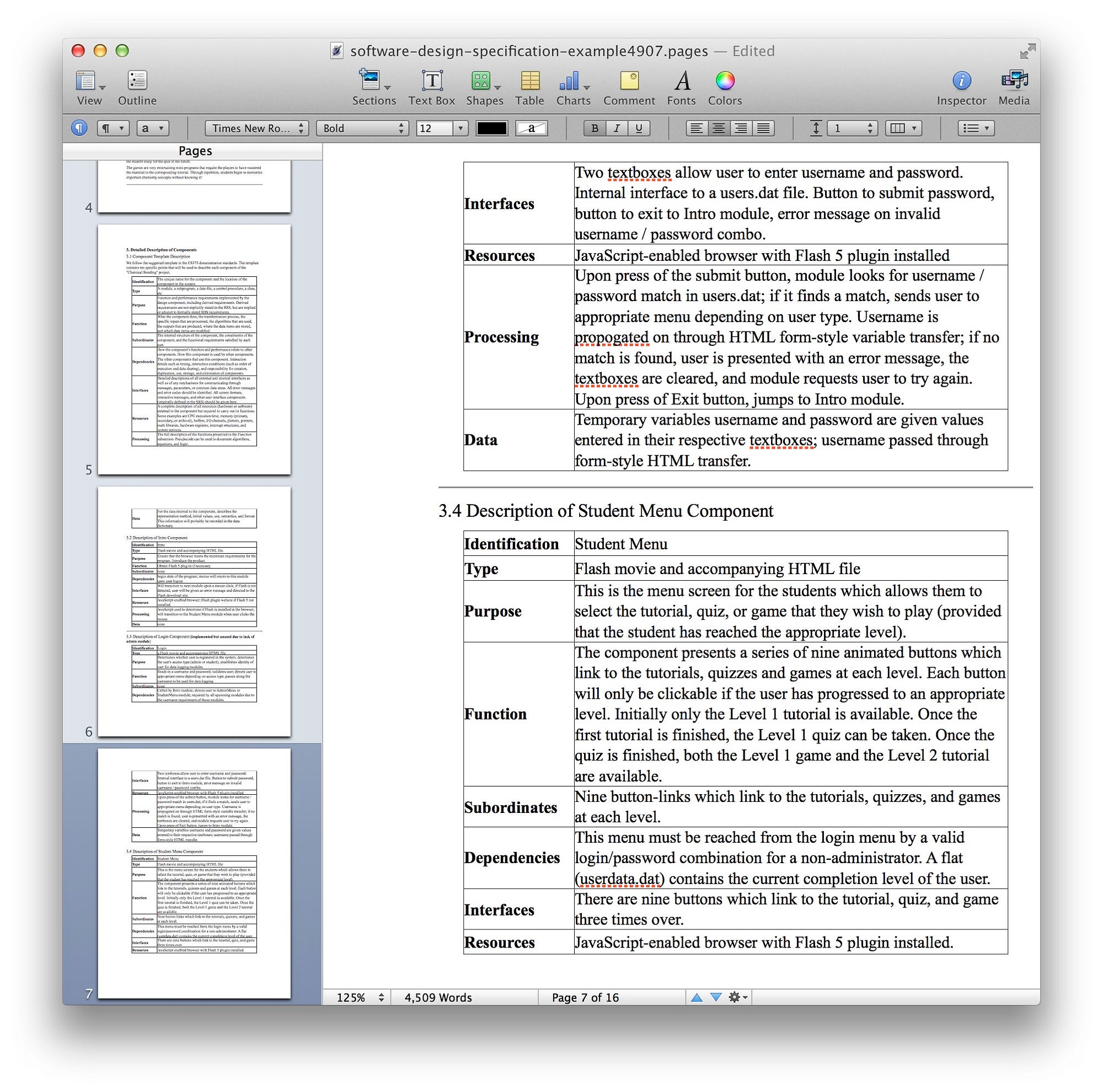 An excellent use of tabular data.
One has to be mindful about using lists as well. If lists take up the whole specification, by page 5 you’re ready to shoot the author, and by page 7 — to shoot yourself.
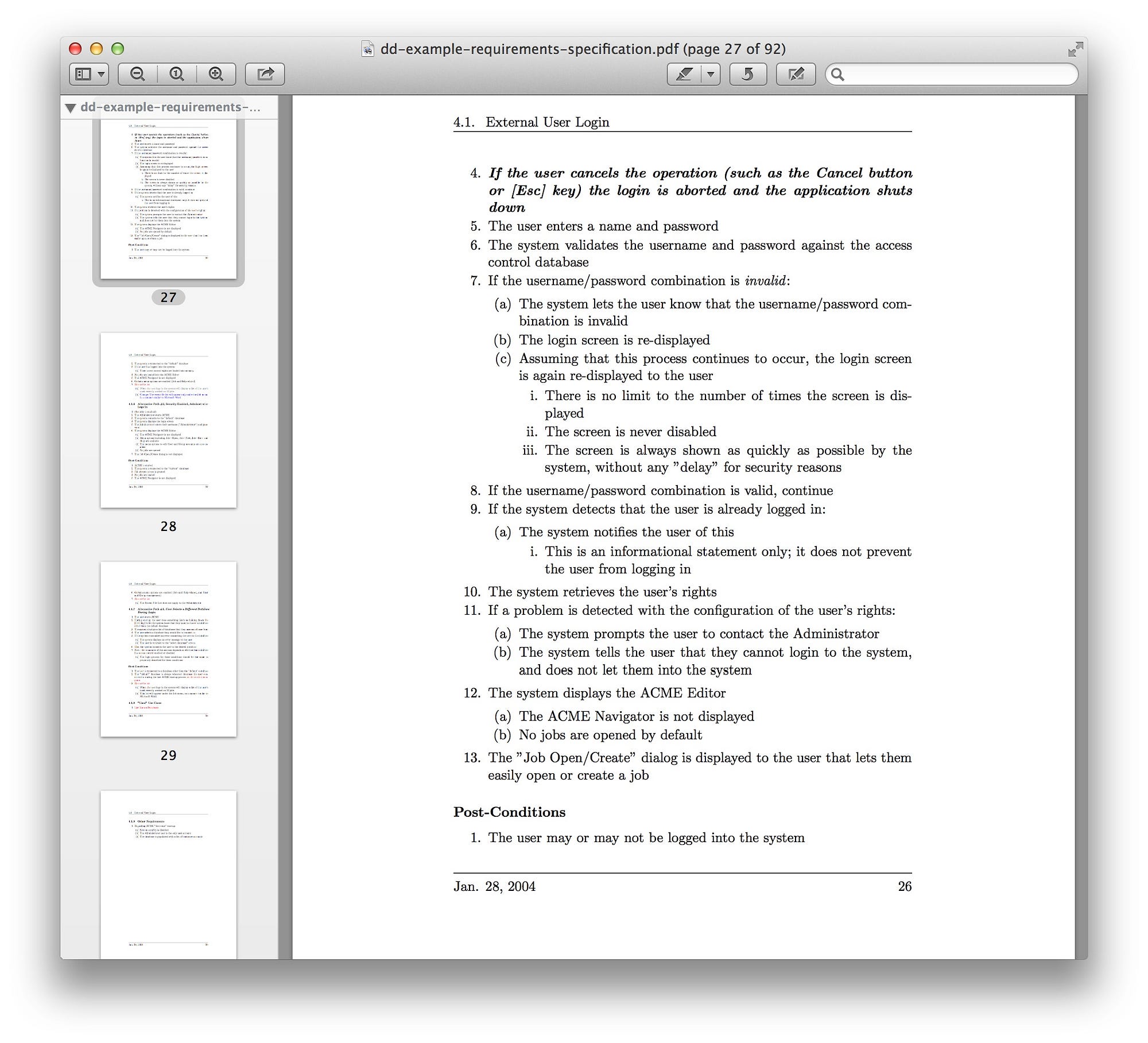 A debilitating usage of lists.
Such an overuse of lists will spoil your karma. Don’t do that.
Narrative
Usually product owners do not like narratives. Tables, diagrams and lists might work to some extent. Writing a coherent story, though, is beyond a product owner’s powers. That’s why narrative specifications almost never occur in the wild. I took the liberty to write one, for the sake of example:
A tale about John and batch DnD
John is planning his team’s next iteration. He looks at a board. There are many cards on the board. On the left he sees the list of cards in the backlog. John scans the names of the user stories and understands that the first three stories have to be completed in the next release. John habitually presses Ctrl and clicks on each of the cards. The cards become welcomingly yellow in response. John grabs the first card and starts dragging it to the column on the right. The cards elegantly flip and transform into one card, crowned by a fancy “3” in the right corner. John moves the cards to the column where they need to go, not letting them loose so far. He is savoring how the column turns yellow as it feels the cards coming.
The happy end
As John drops the card, it unveils the three that he picked up originally. The column regains the usual grey color. The cards blink twice, as if reassuring that they feel at home here, and acquire their usual looks as well. John is happy.
The unhappy end
As John drops the card, he all of a sudden sees a red alarm message: “You have no permissions to drag user stories from iteration to iteration, my friend. Ask your admin, maybe he will help”. The cards jump back to the left column and keep their yellowness, so John can fully feel his own misery as compared to the all-mightiness of the system developers.
It might seem that such a specification would be much easier to read and understand, compared to the dry language of tables and lists. The emotional delivery unfolds one’s motivation helping you to sense and envision the solution. You can’t but feel sorry for John and rush to help him somehow. What if I let John ping the admin right away, just by clicking on a link? Or display a preventive error message before John is about to drop the cards?
Unfortunately, hardly anyone would want to spend a lot of time on a coherent text. It’s easier to shove a table in the document and fill it with dry verbs.
A narrative specification might appear as not formal enough, but with the right images all will be well.
BDD
Behavior-Driven Development has a rather interesting format for requirements. In fact, we describe acceptance criteria for a feature here. If all the acceptance criteria are met, then the feature is considered done. Here’s how a BDD-style specification would look:
As a Scrum Master I want to see a Release BD Chart drawn by weeks
As a Scrum Master
I want to see a Release BD Chart drawn by weeks
When the Iterations practice is disabled
So that I can benefit from the BD chart
Given any development process
When I turn off the Iterations practice in Admin → Processes → Edit
And navigate to the Release BD chart
Then the iteration velocity is replaced by the weekly velocity
And the Chart end date is the same as the Release end date
And the BD chart is drawn by weeks instead of iterations
And the Chart Start Date is the same as the Release Start Date
What’s wrong and what’s right with such an approach? The unified format is definitely a plus. It’s easy to get used to it, and after several weeks one is able to shoot specs in this format without much thought. The format of Given/When/Then gives well-defined feedback to any user action.
Besides, such a specification could be automated. The format has to be made more rigid and a product owner will deliver the scenarios that will turn into automated tests right away. Executable specifications are nothing short of a dream for any developer.
There are some disadvantages, though. First, if something translates well into automated tests, it would be quite the contrary for the human brain. Specifications are written, first and most, for people, not for tests. It’s quite hard for a human to process the BDD format. A specification that includes a dozen such scenarios would look particularly depressing. No better at all than a list or a table and oftentimes even worse, due to the endless loops of Given/When/Then. Such loops create extra background noise, making it even harder to focus on the meaningful things.
BDD scenarios are a great fit when one has to describe how a system interacts with a user, but they are not at all appropriate for telling about the UI in terms non-functional requirements.
With the BDD approach, it’s hardly possible to cover the entire feature in a specification.
Sketches
Many product owners dread pens and get into a bad mood at the sight of a colored pencil set. They feel uncomfortable thinking that hand-drawn sketches look unprofessional and not cool enough. Instead of a pencil, they prefer Visio, OmniGraffle or such other expensive professional tools.
There’s no need to master the art of drawing straight lines with a firm hand, and your eyes closed, if all you want to do is a sketch. One great thing about sketches is that they can be done very quickly. One can take a picture with a smartphone and finally add some spice to the boring spec.
_._](https://cdn-images-1.medium.com/max/2000/1*qzL_sFho0vVG6PDfuNr3_Q.jpeg) Sketching custom reports in Targetprocess 3.
Sketching custom reports in Targetprocess 3.
Usually they sketch interfaces. Sketches are rarely used for more sophisticated things. Can one fill a spec only with sketches? Could be, but probably you might find some better use for your artistic ability.
_._](https://cdn-images-1.medium.com/max/2000/1*SBU8suOnKRa-ag-aG_Dgrw.jpeg) Assign permissions based on role, project and team in Targetprocess 3.
Assign permissions based on role, project and team in Targetprocess 3.
Sketches have one grave flaw: they lack details. By the very definition, a sketch is just a sketch. No additional details are available. It provides a general concept, but by giving developers only a sketch you’re bound to get a bunch of extra questions during the implementation.
_._](https://cdn-images-1.medium.com/max/2000/1*fUqslQEv7RZtKISVKVgXUA.jpeg) Sketching timelines in Targetprocess 3.
Sketching timelines in Targetprocess 3.
If you ask me, sketches are my personal favorites.
Design
There’s only one thing about design: it has to be in place before the implementation. Any hopes that a designer would put something decent together in a couple of days are futile. Designers need time, usually a lot of time. Design work has to start rolling long before the feature gets into implementation.
There’s a bit of a problem here though. It might happen that a feature with a design already completed would not make it into implementation. One has to live with it, with the changing priorities, and only do designs for features that are very likely to actually be implemented.
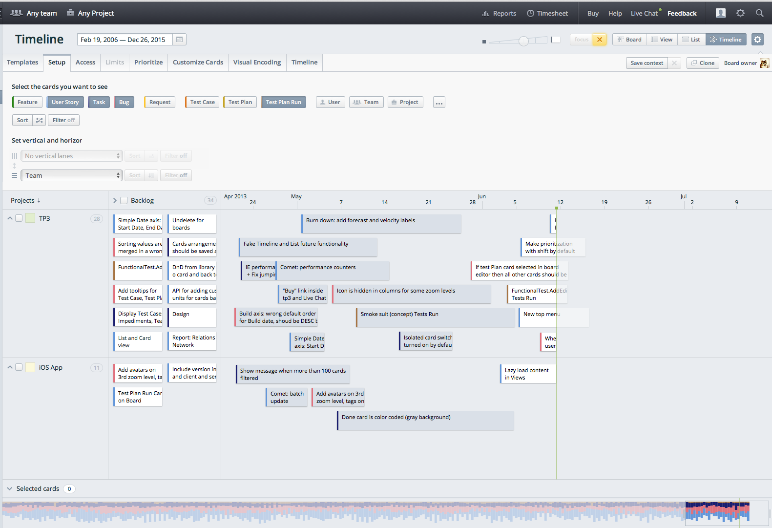 Timelines design in Targetprocess 3.
A turnkey design is a must have in any specification. Can a design replace a specification? Unfortunately, no. Design concepts do not usually provide the complete coverage of all the system states, interaction streams and scenarios. Designs are static and we need something dynamic. It is possible to show dynamic in detailed design as well.
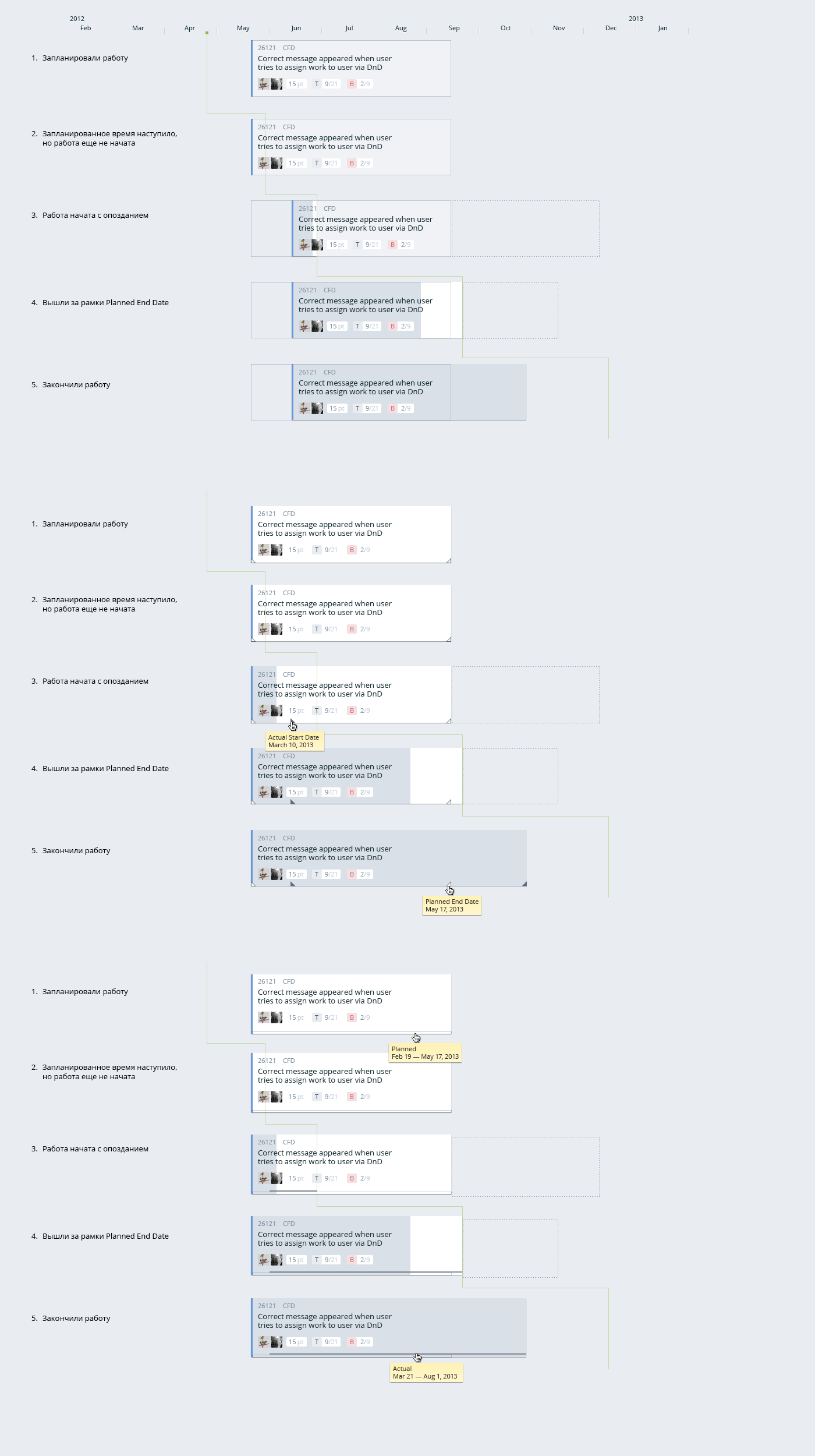 Three variants of cards progress changes in Targetprocess 3.
However, this is an overhead for the most cases. We need something simpler to show dynamic.
Storyboards
Film directors like storyboards. As you might know, a storyboard is a set of key visuals for unfolding a scene.
_)._](https://cdn-images-1.medium.com/max/2000/1*ygt96Vj-kw4jOSOv3Psr7A.jpeg) A storyboard for a film (source).
A storyboard for a film (source).
One doesn’t have to be a great artist to draw storyboards. You just need to draw shaky lines at random angles:
_)._](https://cdn-images-1.medium.com/max/2000/1*lS76yRXjzzWZPgB-GbqofQ.jpeg) A motion graphic storyboard (source).
A motion graphic storyboard (source).
In software development, a storyboard usually features a set of standalone states of a system.
Storyboards are quite compact and helpful if you want to embrace all the states. A great storyboard will also show you the flow between states.
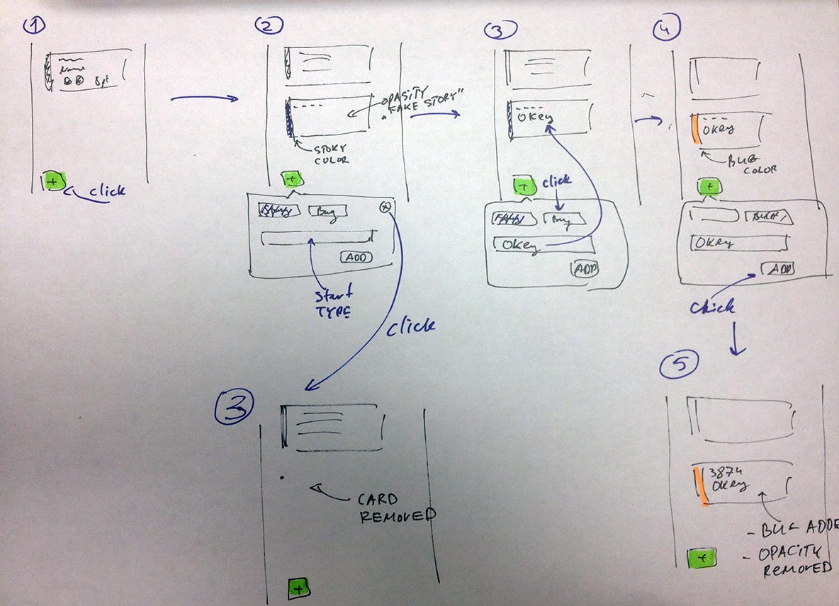 A storyboard for Quick Add in Targetprocess 3 with an alternative scenario.
Unlike the static UI sketches, storyboards give an idea of how users interact with the system. If a storyboard looks fuzzy, the interactions would look fuzzy as well. This fuzziness helps in a way, to think a bit more and to make the interactions flow simpler.
Flows
To understand the system requirements fully, one needs to know which actions can be performed by a user and which states are available in a system. BDD scenarios give a general idea, but one has to read them with full attention to detail and then render them into images that are clear enough for class 1 developers. As this is quite hard, it might be a better idea to draw all the actions and states as flows.
A flow diagram might show how states switch in response to user actions, or it might include some UI elements (in which case it would look similar to a storyboard).
I like to draw flow diagrams just as much as I like to sketch interfaces.
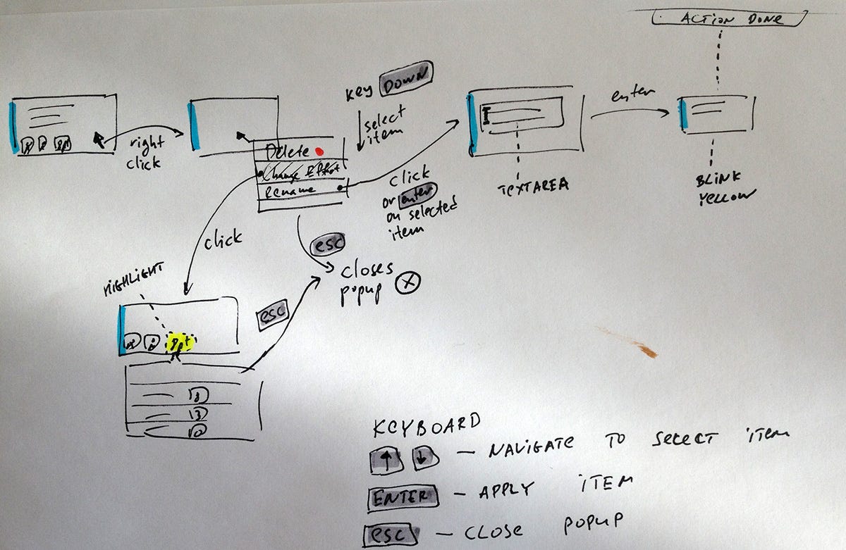 The context menu flow in Targetprocess 3.
Animation (gifs)
All kids like cartoons, but once they find out that it takes 1000 drawings to do one minute of an animation, they give up on the animator’s career altogether.
Still, one can animate storyboards! Animated storyboards are very visual, as they provide a picture of how everything will work.
It’s way faster to create an animation than a live prototype. There’s no real interaction with the UI, but basic use cases can be reproduced just fine.
One needs diligence, patience and some professional deformation to come up with animated gifs. In our team, Igor took some interest in them and came up with a few nice examples:
 A card color change time-lapse that indicates feature progress.
An animation can show some basic stuff, whereas it would be too long and cumbersome for elaborate use cases.
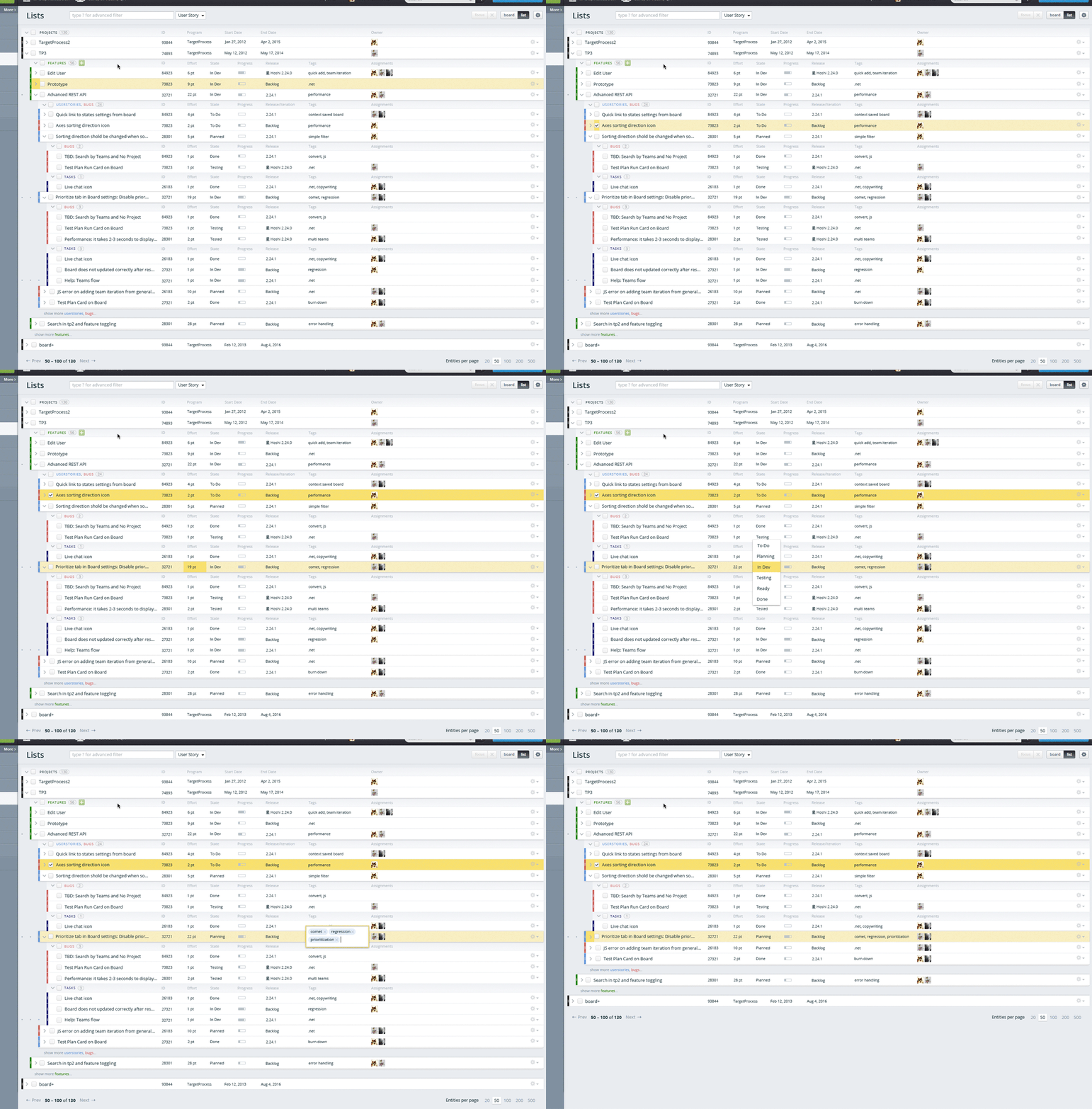 Lists quick edit in Targetprocess 3
Paper prototypes
Not all kids like paper, scissors and glue. Some of them were caught in the act when trying to use scissors for cutting off a bit of the girl-next-door’s hair, others were never able to cut out a decent paper circle, and some have survived the trick of being actually glued to a chair in a classroom. As for the ardent devouts of glue, they just don’t live up to the required professional heights. That’s probably the reason why paper prototypes come across rarely.
It looks so easy: take some paper, draw the UI elements, take a camera, shoot for an hour or two, and cut a quick vid. Forget the vids, why not use paper prototypes to just go over the UI and uncover bottlenecks?
A paper prototype for an iPad app (we did not implement it so far).
One can put a paper prototype in a backpack and go hunting for virgin users who would express their appreciation of this prototype in exchange for a caffe latte in Starbucks, striking open the depths of their authentic user behavior.
Working with paper is fun. One can see interactions very well. Of course, it takes much more time than sketching, but less time than a live prototype. In my opinion, the value of paper prototyping is underestimated in our industry.
A nice paper prototype of an application form.
Interactive specifications
They include both text and graphics, and it’s for that reason that they do the job very well. One has to know a bit about programming for such a spec. Only a few product owners have the required skill set, the majority feel better off with tables and lists.
Oleg Seriaga created the only interactive specification that I’ve ever seen.
_._](https://cdn-images-1.medium.com/max/2000/1*wW7sSdgTZbhc7gIZrKe1dg.jpeg) An interactive spec for the Customize Cards feature in Targetprocess 3. Clickable.
An interactive spec for the Customize Cards feature in Targetprocess 3. Clickable.
One can switch between different sizes and types of cards, and quickly move between the simple properties.
Is it worthwhile to create interactive specifications? It’s more often “no”, than “yes.” Such a specification won’t work as a full prototype. Besides, one can render the same information with a simpler means.
Live prototypes
Most product owners can’t code. They are familiar with some structured data, e.g. tables, queues and hash maps, but they still don’t know how all these work. They have a general idea of cycles and IF statements. But only a few product owners have some hands-on experience with writing the real functional code. All things considered, they are hardly capable of producing a live system prototype. This means they have to ask programmers for help.
A good prototype will give answers to almost all possible questions. One can go over many scenarios and finally feel the real interaction. Prototypes work well for usability tests. One can demo prototypes to customers and have them give their feedback.
It seems that nothing else can work better. But not all is gold that glitters. A prototype can not be regarded as a replacement for specification.
Unfortunately, for the most part prototypes feature success scenarios only. The main job of a prototype is to make a breakthrough, to prove that this solution works. Negative scenarios are not related to this job, that’s why they are silently ignored. But it’s the negative scenarios that matter most for developers, although developers skip any hints of these. Not so for QAs. As a result, developers have to summon their patience and dig into nuances of the system behavior, do some painful bug fixing and elaborate on the “You can’t do that!” error messages.
Lack of details is another problem. Prototypes usually look much different compared to a finished design. It doesn’t matter if a prototype has horrible looks: it has to work, first thing.
_._](https://cdn-images-1.medium.com/max/2000/1*Kl_32_cEBBF1awgOrsLV6Q.jpeg) The very first concept-proof prototype of Targetprocess 3, acclaimed by the customers. Clickable.
The very first concept-proof prototype of Targetprocess 3, acclaimed by the customers. Clickable.
A prototype will surely pave the road to tiresome word juggles, such as finding out small details in the requirements, like “what the max length of this field should be?” Not only has one to recall that a field is supposed to have a length. It takes quite some clicking through the prototype and staring into the code in an attempt to find some clue in there.
So, it’s a no-no, a prototype will never come across as a specification. Rather, it can be a great nice-to-have extra. I wouldn’t instill much trust into a product owner that passes a prototype on to the developer with the words: “All is clear. You can start the implementation.”
Time is another huge negative factor. It takes long to do a prototype. By the way, developers belong to either of the following types: quick or slow. You can have quick developers do the prototypes, but don’t give this job to the slow developers. The quality of code in a prototype doesn’t matter, it can be whatever low. The main part is about scenarios. They need to work. Captain Obvious taps me on the shoulder as I say that, but I was the one who paid extra attention to the quality of code in prototypes in the past.
Specification = Visual Explanation
The goal of any specification is to render concepts as clearly and completely as possible. This works at best when both text and visuals are used. That’s why we need a sensible mix of several methods that we just discussed. This is not an easy job. It takes some creative approach and good will.
Take a look at the chart below. It sums up all the methods. The X-axis shows time and effort required to create a specification. Obviously, a live prototype takes more effort than sketching. The Y-axis shows value. How effective this method is for rendering concepts. Pseudo-narrative specifications are of low value, whereas the design and prototypes are very useful.
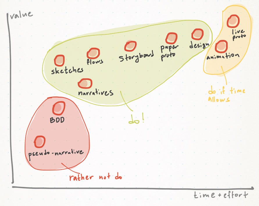 Methods for communicating ideas in one chart (the summary). Y — method value. X — effort to create.
Try to avoid the low-value methods such as extensive BDD scenarios and pseudo-narrative. Sketches, short narratives, flow diagrams, storyboards, paper prototypes and design are a great fit. Animation and live prototypes can be taken on if there’s really a lot of time available.
Take the path of good will, friends. Do try to come up with clear visual specifications, the ones that tell stories in simple language.