Hacker News Redesign
I read the post about Hacker News re-design and didn’t like it. The resulting design is not good. It might be better than original design for large screens, but it distracts people from information. Orange numbers, large vote buttons, quite poor information density… I am not a designer, but the problem looks quite simple and interesting.
Here is my attempt to create a better design for Hacker News. I am aware about some weak sides in this solution and will enumerate them in the end, be patient and don’t fight back right away.
First, I asked myself, how people decide that an article is worth they attention? The process is close to this one:
- Read the title - is it interesting to me?
- Check points - how other people voted?
- Check comments - are there any hot discussion?
- Check age - is it fresh or not?
- Check source - is it credible? (well, this is somewhat stretched)
Currently you have to scan through all numbers of points, comments and age, but that is quite slow. You have to read every number to do a comparison — quite high cognitive load. Is there a better way? I think there is. I took two most important variables and encoded them:
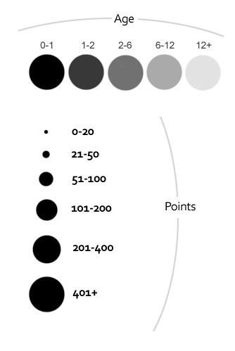
Age is encoded with color. Dark color - fresh news (less than an hour). Light color - old news (half a day or more). Points are encoded with size. Obviously, large circle shows that a post is popular. I took all points and age values from the first HN page and analyzed them. It appeared that 5 groups are enough for age, while 6 groups for points may work.
Another idea was to highlight titles. Here I took a theme of Readable HN Chrome extension and modified it. Each news item is a “one-liner” with a large title, so you can scan items easier. Comments are aligned to speed up comparison as well. Here is the final result:

You can find important and fresh articles really quickly. This design provides a high level view on all news.
I explicitly removed numbers like 1..30 from the page. I don’t think they are useful. Something much simpler can be added to show page number.
Here are detailed explanations:

When you put cursor over circle, you see exact points and age information as well as vote up button. This information is hidden initially to make scanning easier, but is available when you need it.

There are no colors in the design. Colors will attract too much attention. It is possible to highlight very important things in general, but I am not sure what can it be on HN.
Here is HN original design for comparison:

So what are know problems?
- Information density is not as good as in original HN design. It can be improved I think without eliminating the original idea.
- It is not obvious out of the box that you can vote for news. You should put cursor over a title to see the action. But I don’t think that is a problem.
- Page number should be visible somewhere.
- Ability to flag a submission is missed. But it can be easily added on a cursor over near vote up action.