First impression failures
Imagine you open an application first time. You see some buttons, labels, empty areas, unfamiliar terms, menus, options and dummy data. You stare at it for a few seconds and start to click, type, think, explore. You try things, hoping to get basic principles and the general idea of the UI. You try to understand the main concept of the application.
You do some progress and have an obstacle. You get back and try another path and get stuck. You try again (with same result). You may even like the design and it all looks promising, you feel that application can be helpful. But then you fed up with all these stoppers and go away. You never return back…
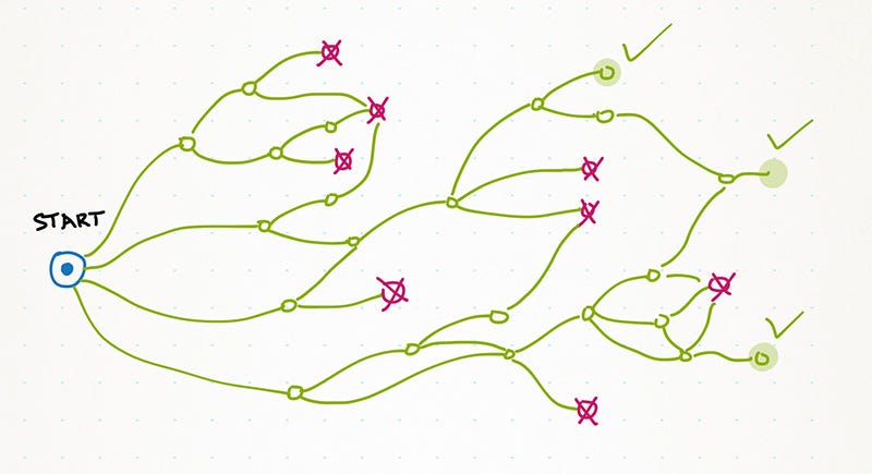 User starts to explore an application and there are just few routes lead to success.
Every moderately complex application that solves many problems has many paths to get started. People have very different scenarios in their heads and it’s impossible to make a single path good for all.
Unfortunately, people stuck at many points and have to flip back (see an image above). There are surprisingly too few ways to really dig through all the routes and accomplish something significant. What the problem? An application doesn’t help you to overcome difficulties. It stays passive and looks how you struggle.
Here are the typical anti-patterns. I should say we made all these mistakes in an application I work on:
- Error messages with no clear guidance about how to correct things. Even if message explains a problem, there’s no direct link to the UI area where the problem can be actually corrected by a user. I read the message and then what? Where should I go to fix this?
- Absence of actions in places where a user expects it. The action does exist, but it’s hidden somewhere else and hard to find.
- No tooltips and no explanations of UI elements. What will happen when I click this button? Hmm… That is not what I expected…
- Many prerequisites to do something. First — add this, then — add that, and only then add what you really want. Pfff…
- Annoying help system. Such help system is often created in a desperate attempt to fight complexity and all the problems above. Well, it just makes things worse. Now a user will deal with complexity and this bloody help system thinking “WTF, how can I switch this help off???”
Fix the flow
You should fix most bad routes and provide guidance to the user. He should clearly understand how to overcome the obstacle, where to find additional information, what to do next. As a result, you will have more successes:
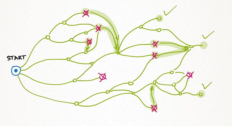 Find the obstacles and design flows to connect various routes. Help a user to have a smooth start with your software.
It’s easy to say “fix the routes”, but how to spot them? You just can’t have a fresh look at your application, since you designed it. No matter how hard you try, how drunk you are, how sleepy or tired — you’ll take the same routes again and again. You need the outsiders.
We tried a very easy yet efficient approach. We asked people from our target audience to get free version of TargetProcess 3, record first 10-20 minutes of getting started experience and send the videos to us!
This method is better than a usual live usability test session, since a person who records a video is relaxed, no push and no pressure. This is as close to the real first-time user experience as it can be.
It took some reasonable effort to find those people, but in a few weeks we had a dozen recorded sessions. Oh, boy! Some people had awful, terrible time trying to figure out how to plan a project in TargetProcess 3! It was a pain to watch the video and I wanted to scream “You saw this error message twice! Didn’t you get it? Can you read?” When I overcame this first reaction it became obvious that we fucked up. We made every. possible. mistake. from the list above. Let’s check some examples. Maybe some of them will be hard to understand without a context, but I hope you’ll get the main idea anyway.
Examples
Error messages
Most likely there is no software without at least one bad error. TargetProcess is full of weird errors so far, but we fight them. One by one.
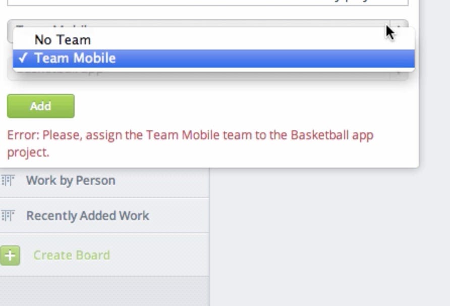 Nasty error message without clear action.
Here is the brilliant example, but first you have to understand the context. There are projects and teams in TargetProcess. You can create them and set relations like Team A works on Projects A and B. Then you can add work to these projects and teams. If you don’t set relation between Project A and Team A, you can’t add work to this pair (you still can add work to project alone). Some users missed the idea and tried to add work, while there were no relation between team and project. They got an error like ”Please, assign the Team A team to the Project A project”. While it sounds OK after my explanation, it is totally confusing for the newcomer: “Assign team to project? Where can I do that?”
The solution is to provide a direct link right after the error message that opens a team view, and make it clear that you can select a project and assign it to a team.
Absence of Actions
Think twice when you hide an action somewhere deep inside an application. We did this mistake with Add User action.
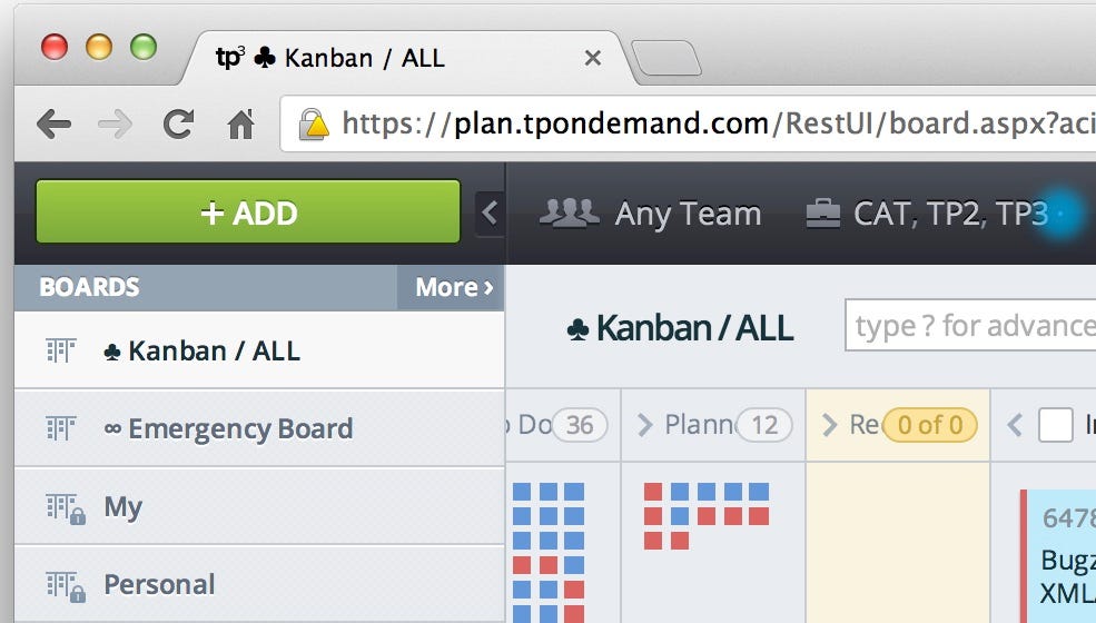 Large add button with many actions, but without Add User action.
There is a large green Add button in the left top corner that allows you to add everything… Everything, except a new User. It is possible to add a new user when you creating a project or team, but if you miss that, you’ll have a hard time figuring that out. We have this general Add button with many actions, why the hell we forbid to add a new user via it? No good reason, to be honest. Just a dumb mistake.
No explanations
The main goal of the first-sight UX is to help a user answer a question “Is it useful? Will it solve my problems?” To answer them, user should understand the concept. And that is not an easy thing. It’s really hard to explain an application concept in few minutes and we’ve failed to do that so far.
TargetProcess 3 is an agile project management application, but quite unusual one. It allows you to extract and present information using 2D boards. Each board is just a view on a data from a particular angle. We thought that step-by-step guide is a good idea to introduce the application. Well, it is, but just for the user interface. Yes, people found their way through UI, but didn’t get the whole thing. This lead to mistakes that were unsolvable without the concept understanding.
To fix this problem, we’ve added explanatory video before the step-by-step guide that explains the concept.
Many prerequisites
Luckily, we almost spare of this error. There are few required fields and usually you can create everything without many additional actions. But many applications do the opposite. I feel terrible when I should fill out the fields that I don’t really want to fill. For example, in one application it was impossible to add a task without estimate. But I don’t estimate tasks, I just add them and close them!
Annoying help system
Several people wanted to turn the getting started wizard off, but just can’t. Somehow they didn’t find the required action. Quick test! Can you find how to terminate the help in 5 seconds?
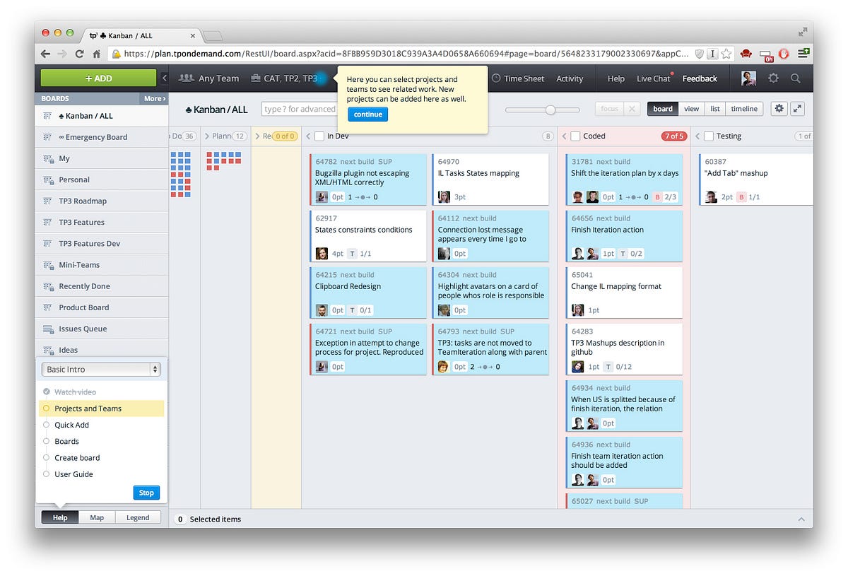 TargetProcess 3 User Interface
We don’t want to remove the getting started wizard completely, so we redesigned it to make it more visible (not released yet :)
We found more than 50 obstacles that break getting started flows. Now we are removing them. Some of our initial assumptions were wrong. Get feedback, fix things — that’s the only strategy.