1-click vs. 2-clicks design
I was always confused by two buttons in Google Doc editor: highlight text and highlight background. I constantly made the same mistake again and again clicking on the wrong button. I used this feature several years, but still did wrong clicks…
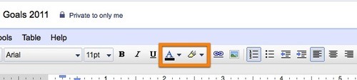
This year they changed icons and I finally learned them!
The second icon is very good, it clearly shows that background color is here. First icon was unchanged (almost) and it is still wrong. So I learned the second icon finally and rarely click to the wrong one.
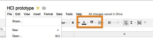
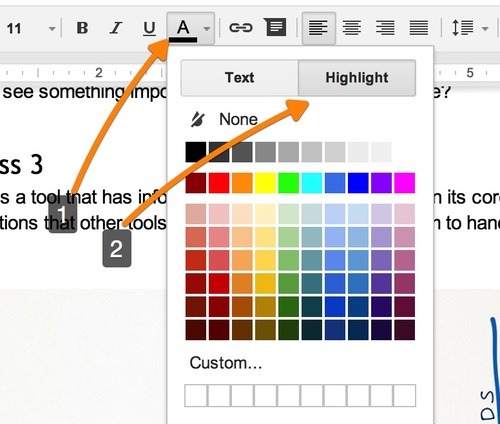
However, recently Google changed that and combined both actions into a single button. Am I happy? Hell no! Initial design was good, just with wrong icons. It was a 1-click design. New design is a 2-click design and I don’t like this change.
Interestingly, I never hit wrong icon in MS Word. Maybe it they have good icons? Pages also has a clear solution:

While I think Google Doc Editor is the best online editor, it got slightly worse this week.